How to Organize Docs & Files in Basecamp
Every Basecamp project collects files. Contracts, brand assets, exported PDFs, a screenshot a client dropped in three weeks ago. Basecamp keeps them in Docs & Files, and by default that’s a single vertical list of names. When you know the exact filename, the list is fine. When you’re looking for “that one mockup” and you have forty items, you’re reading down a column of near-identical rows, opening things to check, and backing out again. This guide covers how Basecamp’s Docs & Files works on its own, where the plain list slows you down, and how to switch it to a visual grid with previews so you can find a file by looking at it instead of reading its name.
How does Basecamp’s Docs & Files section work?
Docs & Files is Basecamp’s built-in home for documents and uploads inside each project. It does the fundamentals well:
- Folders to group related files, and you can nest them.
- Colors on cards so you can mark a folder or file by eye.
- Drag to arrange items into the order you want.
- Comments on any document, so discussion stays attached to the file.
Everything lives inside the project, respects the project’s access rules, and stays in sync for everyone on the team.
The catch is how it’s displayed. By default you get a list: a small icon, the name, and a little metadata per row. For text documents that reads fine. For anything visual, the list hides the one thing that would help you most, which is what the file actually looks like.
Why finding files in the list view gets slow
Two things make a long Docs & Files list harder to work than it should be:
- Folders look identical. A folder called “Client Assets” and one called “Internal Drafts” are the same icon and the same shape. You open one, realise it’s the wrong one, come back, open the next. The list gives you names, not contents.
- Images have no preview. A screenshot, a logo, a design export, they all show as a generic file row. To see which image is which, you open each one. On a project with a dozen visual files, that’s a dozen clicks to reach the right frame.
Basecamp isn’t wrong to default to a list. It’s clean and it loads fast. It just wasn’t built for the moment when you’re scanning for something visual and the name alone doesn’t tell you enough.
How to switch Basecamp Docs & Files to a grid view
Assistant for Basecamp is a Chrome extension that runs inside Basecamp and adds a List / Grid toggle to the top of any project’s Docs & Files section. Flip it to Grid and the same files rearrange into cards you can actually see. Your files don’t move or change; only how they’re shown does, and your choice is remembered so the section opens the way you left it next time.
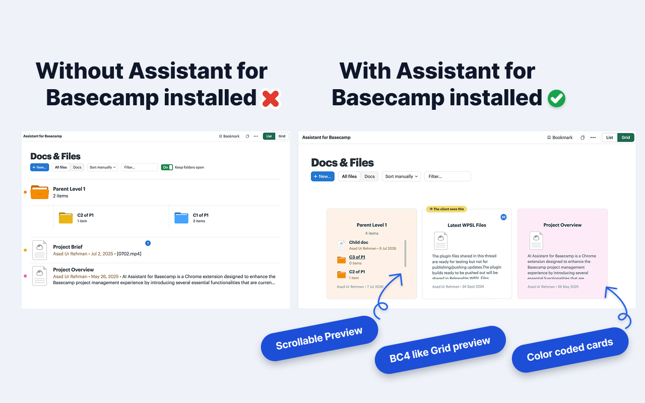
Each card carries more than a row ever could:
- Folder previews. A folder card peeks at what’s inside, so you can tell “Client Assets” from “Internal Drafts” without opening either.
- Image thumbnails. Photos, screenshots, and design exports preview right on the card. You find the mockup by seeing it.
- Comment counts. A glance tells you which documents have discussion on them and which are quiet.
- Custom field pills. If you use custom fields on documents, their values show as colored pills on the card, so status or category is visible without opening the file.
- Native colors. The colors you’ve already set in Basecamp carry over, so your existing system still reads at a glance.
Reordering without losing your place
You can drag cards in the grid to reorder documents and folders, and the new order saves back to Basecamp, so everyone on the project sees the same arrangement. It’s the same drag-to-arrange Basecamp already supports, just done against previews you can recognise instead of a column of names. For the full behaviour, see the Docs & Files grid help doc.
Where Basecamp’s native list still fits
A grid isn’t always the right view, and it isn’t the whole story:
- Text-heavy sections. If a project’s Docs & Files is mostly written documents with descriptive names, the list is already fast. Previews help most when the content is visual.
- Mobile and the Basecamp app. Assistant is a Chrome extension, so the grid appears when you’re working in Basecamp in a Chromium browser on desktop, not in the native mobile app. On your phone you get Basecamp’s own list.
The toggle means you’re never stuck with one or the other. Switch to Grid when you’re hunting for something visual, back to List when you just want names.
What pairs well with a cleaner file view
Once files are easy to scan, a few other things make a project easier to run:
- Put status or category on documents with custom fields so the pills on each card mean something.
- Bring the same at-a-glance thinking to your tasks with a Kanban board on Basecamp.
- Catch new activity on files and everything else with the unread highlight.
Assistant is one flat price for the whole team: $29/month or $290/year, unlimited seats, with a 7-day free trial and no credit card. One admin subscribes and everyone on that Basecamp account gets the grid view.
The short version
Basecamp’s Docs & Files defaults to a plain list, which is fine until you’re scanning for something visual and every row looks the same. Install Assistant for Basecamp, flip Docs & Files to Grid, and your folders show previews, your images show thumbnails, and you find a file by looking at it instead of reading its name. Switch back to List anytime, your files never change.
Useful? Tell Google you want more of this.